Venture
.jpg)
Design a mobile app,
Logo & brand exploration
Figma, Maze, Miro
UX/UI Designer
(Research and Visual Design)
Escape is a new adventure finder app. They thrive in encouraging people to overcome their fears by helping them sign up for an adventure with the help of a tour guide and fellow companions. It acts as a bridge between novice thrill seekers and tour guides and along with that forms a sense of community. The challenge is to have it all in one app.
Market Research
Competitive Analysis
User Interviews
Affinity Mapping
HMW
Feature Prioritization
User Persona
User Flows
Task Flows
Wireframes
Logo and Branding
Usability Testing
High-Fidelity Prototype
Initial research was conducted to learn more about the adventure travel industry. This includes deep dive into current trends followed by the adventure enthusiasts and learning more about the demographics that are attracted to thrill and adventure and researching about their needs to make them feel motivated towards pursuing different adventures. Researching helped me understand what a thrill seeker is looking for when he/she decides to do one.
After completing market research, I performed a competitive analysis to identify the strengths and weaknesses of direct competitor apps. This allowed me to take note on what I should focus on and avoid when designing the Escape mobile app.
.png)
To better understand my users’ goals and pain points, I conducted six contextual inquiry interviews using my own Interview Guide that consisted of open-ended questions about their behavior when signing up for an adventure, their other preferences
Once the interviews were conducted, I was able to organize all the feedback into an affinity map that helped me uncover user needs based on patterns from insights

"How might we" questions were formulated using the insights and needs from my affinity map. These HMW statements then helped me address important aspects of the app design.

Based on my insights and HMW statements, I created a feature prioritization graph to prioritize key elements that should be included in the app design.

A primary user persona was created based on insights and patterns discovered through my user interviews and affinity map. This persona helped me to understand the primary users as a whole when it came to their motivations, goals, needs, and frustrations

User flows were created to represent the paths a user may take in order to complete primary tasks on the app. This helped in planning which key screens needed to be designed and prototyped.

With the application map complete, I sketched out some preliminary concepts for the main screens that I'd need to design.

After completing low-fidelity sketch ideas, I was able to move on to designing the mid-fidelity wireframes in Figma. This helped me connect the conceptual structure to the product’s visual design. The wireframes here shows some of the key screens based on the sketches above.

In order to ensure that my mobile prototype was both user-friendly and easy to navigate, I conducted an unmoderated usability testing with 10 participants using Maze. Participants were asked to complete 3 key tasks and then asked a few questions after task completion about their experience through the prototype. A total of 21 key screens were created to allow users to complete task prompts.
Task 1: Find a beginner paddle board adventure to do with a group of people and book it.
Task 2: Find a tour guide for paddle boarding based on their highest ratings and who is near by you.
Task 3: Go to your profile and click on your next adventure.
Questions asked after task completion:
1. How clear was it to find a paddle boarding adventure? Rate 1 to 5, 1= confusing 5=very clear
2. What is your thought on the overall design?
3. How was your experience in navigating between screens?
4. What else would you like to have on the app that can help you find an adventure to get you out of your comfort zone?
Once testing was complete, all responses were included in a testing document. From there, error-free and test completion rates were calculated and a summary of feedback was created to provide a high level overview of testing feedback.
Task 1
Completion Rate: 80%
Average Duration: 164 seconds
Give Up Rate: 20%
Task 2
Completion Rate: 87%
Average Duration: 78 seconds
Give Up Rate: 13%
Task 3
Completion Rate: 100%
Average Duration: 7 seconds
Give Up Rate: 0%
After getting the feedback from my participants, I laid out all the comments, suggestions and frustrations. This allowed me to find patterns amongst participants and pin point slips and items that I could have missed.

Pure Rx is a brand new mobile app concept so I started with sketching out preliminary concepts for logo design while keeping in mind brand attributes: Energetic, Vibrant, Youthful, Encouragement
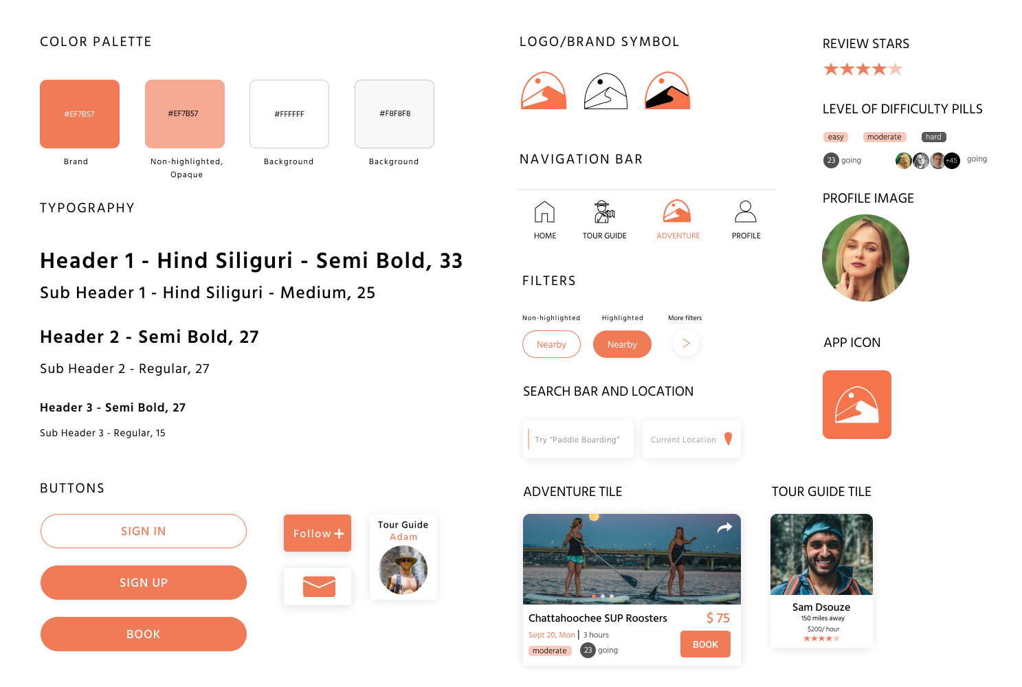
I added a few more features on the adventure tile like level of difficulty, duration of an adventure, cost and a booking button for the user to book an adventure.

I also added Tour Guide's Expertise Areas and Tour Guide Button on detailed Adventure Frame as per the feedback I received from my users.

Below is the High-fi Prototype showing the home screen, user profile screen and tour guide's reviews.

High-Fidelity Prototype for Adventure Booking Journey

I approached this project with one umbrella goal in mind: identify why people refrain from going for different adventure sports and what are they looking for to make that leap of faith and try something new. It was challenging to understand what users are looking for and then even more challenging was to implement different pain points in my prototype to make the experience of the user seamless. I understood how important the social connectivity and group activities are for humans.
I thoroughly enjoyed the creative aspects of the project. I hope more people get inspired and motivate themselves to enjoy these outdoor activities in these dire times. A few next steps in the app design would be adding more filter options for the users, enabling users to get discounts if enrolling for more than 5 people, adding more pictures of users who have completed this activity in the past, adding more emotional triggers to push the user to commit to an outdoor adventure.