Alpaca Haven Farm
User Research,
Redesign website infrastructure,
Rebrand
Figma, Procreate, Maze
UX/UI Designer
(Research and Visual Design)
L&R Alpaca Haven Farm is a local family owned business in Georgia offering a variety of private services and group events with the Alpacas. They want to enhance their online presence by revamping their current website - https://www.lralpaca.com/. The website is not functional as per usability is concerned and needs restructuring of the content.

Interview and Observation were two key things I used to understand how the user navigates through the website.

I asked 4 participants to conduct an open card sort, where they sorted 33 cards into a few groups as per their intuition. Based on the sorting result, I identified the most commonly-used labels and groups. I used that to make primary navigation bar and structure of the content on website.

I performed a competitive analysis to identify the strengths and weaknesses of direct, local competitors in Georgia. This allowed me to take note on what I should focus on and avoid when building L&R Alpaca Farm website

Understanding users pain points and needs helped me in framing my HMW statements and helped me get a good focus on what I should be focusing while re-designing.


I proposed a arify thstructure of the pages within the site to help me better visualize and understand the information architecture.


I designed the user flow by keeping in mind my user who would like to have enough information before going further to visit the farm. Also, I focused on making it easier for the user to find all the services the farm has to offer and also making the checkout process easier and quick.

After completing low-fidelity sketch ideas, I was able to move on to designing the mid-fidelity wireframes in Figma. This helped me connect the conceptual structure to the product’s visual design. The wireframes here shows some of the key pages based on the sketches above.


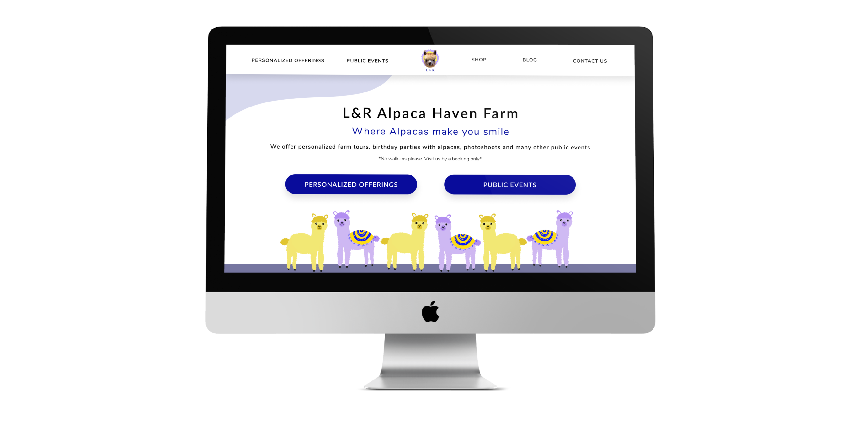
After talking to the owners Laura and Rick about the branding, they mentioned to me that they wanted their brand to represent fun, friendly and warmth moods when someone thinks of their farm. They also wanted one of their Alpacas on their logos, so I made sure they liked the logo I had made after reviewing with them the different versions of logos I had made for them.
They absolutely loved the homepage and the Alpaca illustration I made in yellow and lilac.

Using Maze, 8 Participants were asked to complete 3 key tasks and then asked a few questions after task completion about their experience through the prototype.
Task 1: You're looking to book a private party for your child's birthday, try to find it and make the payment
Task 2: Find an Painting event to do with your friends
Task 3: Buy a yellow alpaca shawl
Questions asked after the tasks:
1. How was the flow of the website and navigation in terms of going from one page to another?
2. Was there something that confused you on the website?
3. What was something that you liked the most on the website?
4. Any other information you would like to have?
1. Almost all users were confused on how to make a reservation for their kids birthday party. The misclick rate was really high and I could see that the users were getting confused between the UX writing part - Farm tours and Upcoming Events. I realized then that I would need to change the naming of both the buttons to differentiate better between the two. This helped me understand how important the verbiage is in UX writing.
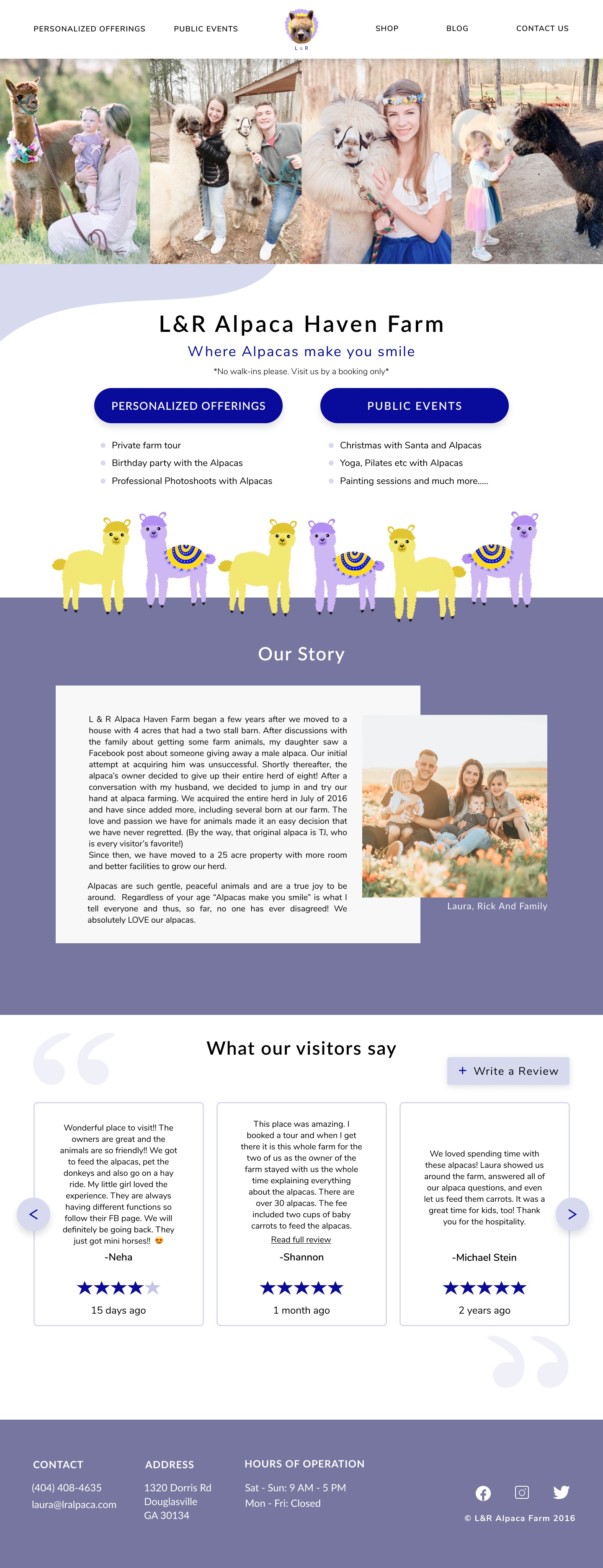
2. The users also were confused with the navigation. Hence I divided the "Visit Us" item on the navigation menu to have two separate categories -> 1. Personalized Offerings 2. Public Events
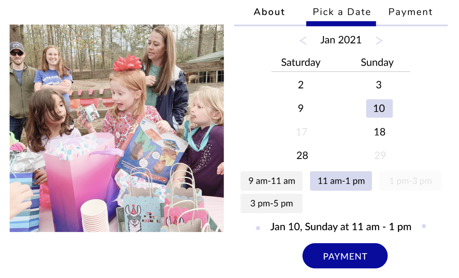
3. The users also were confused on About, Pick a Date and Payment selection as they were getting distracted by the carousel arrows.
1 : Improvised the verbiage inside my main buttons
Before

After

2 : Changed the navigation menu to help users find the different options that are offered by the farm
Before

After

3 : Modified the date picker to be more user friendly and easy to find a date and time
Before

After
After making the above changes, I decided to test my prototype using Maze with a 9 new users who had not seen the prototype before. Below are the test completion rates and the feedback I received on the questions from the user test.


As I reflect on this project, I have come to realize that the journey of a designer is always non-linear. It is guided by user and they play a really vital role in whether your work will hold any importance. I also came to know that emphasis should be put on the verbiage and the words that could be used to portray your pieces of work. I learnt a lot where my design lacked when I conducted the first usability test. It clearly opened my eyes on where I would have to make changes till it is easily navigable and smooth. From a researcher’s perspective, this project allowed me to explore other ways to conduct user research through open card sort and to not feel shy to conduct multiple usability tests. I was also was able to hone in on my visual creativity by thinking about how to adequately fill white space while still allowing the page to breathe freely.
As you can see the Alpacas and I are clearly in awe of each other 😁

